
UniFund
Discover the Smarter Way to Fund Your Education
Overview
For many students, college can be a fun, new experience they are eager to start. However, the complexity of how to finance college is not so fun. There are many ways to receive financial assistance, but where does the process start?
UniFund is a website where students have an all in one guide on how to finance their schooling in the most convenient way possible.
Purpose: Case Study
Objective: Decreasing the stressors of financial aid by creating multiple, easy to use tools on one platform rather than multiple.
Key Insights: Users found applying for financial aid the most difficult stage of applying to college. More websites caused more confusion.
My Role: UX Researcher & Designer
Duration: 3 months
Tools Used: Figma, Maze, Google Slides, Pen & Paper
Project Objectives
-

Discover
Thorough research starts with asking complex questions. With these questions we can discover users’ pain points. In the discover stage our goal is to figure out the most frustrating part of applying to college and the stages that bring the most confusion and uncertainty.
-

Define
In order to empathize with our users we must figure out what motivates them to even apply to college. What is their why? What is their purpose? Then we can hypothesize ways to alleviate the stressors of the process by targeting the attributes that bring them the most satisfaction.
-

Design
Now that we have grasped an understanding of our users, we can design simple solutions that bring great change. The designs include the MVP that sets us apart from competitors and most importantly, alleviates the pain points they previously experienced.
User Interviews
-
Target Users
UniFund’s target audience were upcoming or current undergraduate students, averaging between 18-23 years old.
In the screening process for interviewees, we made sure each individual was either an upcoming, current, or recently graduated college student.
This ensured that the interviewees were of a relevant demographic and could accurately express their experiences with applying for undergraduate college.
-
Interview Questions
We interviewed 8 individuals and asked them general questions about their college application process. From those responses, we asked more specific questions geared towards their pain points and needs.
For example, we asked about who helped them with the process or what online tools they used. They were also prompted to give examples of when they encountered their greatest hardship in the application process and how they overcame it.
-
Findings
Through our interviews, we learned users were motivated by family circumstances, future finances, and the desire to achieve more in life.
Common pain points included unfamiliar financial aid jargon, too many search results and websites to sort through, and not as many scholarships to apply for as advertised.
Personas


Through research synthesis, we developed the personas of Tori and Chris. For both students, tuition cost is a crucial deciding factor on where they will attend college. Tori is the first generation in her family to go to college, so it is important for her to have both easy access to tuition cost as well as a step by step guide to help her with the unfamiliar terminology and process of applying to college.
On the other hand, Chris is a student athlete looking for athletic scholarships that will alleviate the cost of tuition. He is also a full-time employee, so he does not have much time to look through multiple sites for multiple different scholarships. Chris needs a website where he can search through multiple athletic scholarships at once while also being able to keep track of the ones that best fit his credentials.
Journey Mapping

In order to ensure we focus on and understand Tori’s struggles, we translated her persona into a journey map.
The journey map represents Tori’s actions and emotions when searching for universities and funding. By exploring the customer’s experience with our target user, we uncovered the following:
Affirmation: The journey map reassured our findings from our research and synthesis. Users struggle to find universities that fit their academic needs and extracurricular activities that also offer a variety of scholarships.
Abandonment: Users were so frustrated with the lack of time they had to apply for universities and financial aid, they abandoned their tasks all together. Also, the jargon used on their state’s financial aid application was too confusing to understand, which lead them to feeling defeat or incapable.
Informed Optimism: Based on user interviews, we discovered that our ideal user became more comfortable with the application process when feeling more informed about the process. The more they could easily understand, the more they were willing to continue the steps of completing their applications.
Ideation & Testing
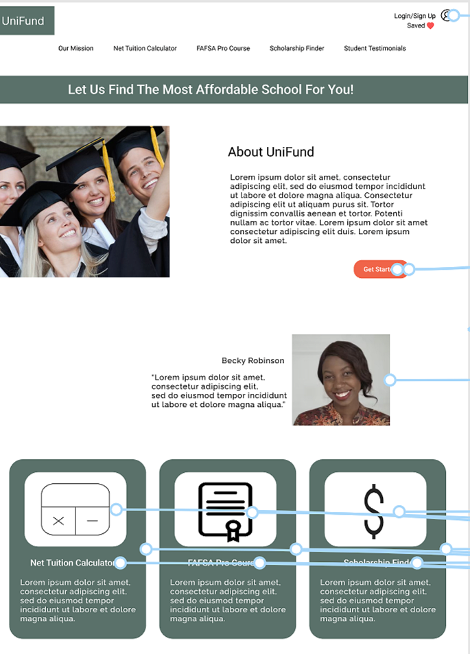
After synthesizing the information from our user interviews and journey maps, it was clear that in oreder to help our users, our website needed three key features: personal profile, net tuition calculator and FAFSA pro course.
The personal profile would help organize user’s information and resources they have collected throughout their journey. The ability to save scholarships to a profile, allows the user to easily access them at anytime and keep track of what is completed and what is incompleted.
Cost of schooling is our number one focus to help alleviate user stress. The net tuition calculator is composed of a variety of schools that provide a breakdown of what the student is paying for and the cost of each component.
As discussed previously, the jargon used on financial aid applications can be confusing and foreign to students. The FAFSA pro course, was created to break down the application in a simpler way, so students could understand exactly what is needed from them to complete a successful application and gain as much aid as possible.

Personal Profile Sketch

FAFSA Pro Course Sketch

Net Tuition Calculator Sketch

Personal Profile Lo-Fi

FAFSA Pro Course Lo-Fi

Net Tuition Calculator Lo-Fi
Testing the Prototype

UniFund prototype was developed in Figma and tested in Maze. Users were sent a link to the Maze and given prompts to navigate the website.
There were 6 missions where they were instructed to locate a certain feature on the site. At the end, there was a 5 point scale for users to rate how easy the site was to navigate.
There were a total of 12 users and the average score of the website was a 3.8.
Usibility Insights
After testing out our high-frame prototype, we discovered a few interactions needed some revisions…
Saved Scholarships: When attempting to go to saved scholarships, users went to the resources tab. There was a disconnect between users’ account and saved information, so we added a “Saved” button next to their profile icon.
Navigation Overlay: Users were using the resources tab to toggle back and forth between pages. In order to make each page visible, we discarded the resources tab and listed out each page individually at the top of the screen.
Wider Button Range: Users were pressing on the parameters of the button and not the “Login” text on the button. When users attempted to click on the resources cards on the homepage, they clicked on the actual card or picture and not the text. To make our buttons more clickable, we widended the range of the buttons and added more buttons that achieve the original goal.
What’s Next?
More Testing
Since testing our first protoype, we made revisons to the UniFund website and should conduct more tests to ensure the revisions have a more “user friendly” navigation and experience.
Accessibility
The flow of the Unifund website is critical for users, so incorporating more accessibility features such as a back button and scroll indication could be helpful for more sucessful pathways.
User Interviews
We should conduct more user interviews with many more participants in order to gain insight on how to better the current features while also possibly adding more.
App Creation
Websites are great, but apps are more convient. Creating an app for UniFund will make our tools readily available for users. The easier it is for users to access our porduct, the more they will utilize the full potiential of what UniFund has to offer.
Aesthetics
Even though there was not any feedback on the design of the website, brainstorming new color palettes and design layouts could help make UniFund more visually pleasing and inviting to its users.
Advertising
Promoting our product is crucial for exposure and brand outreech. UniFund should be advertised throughout high schools and colleges to inform our target users about our product.